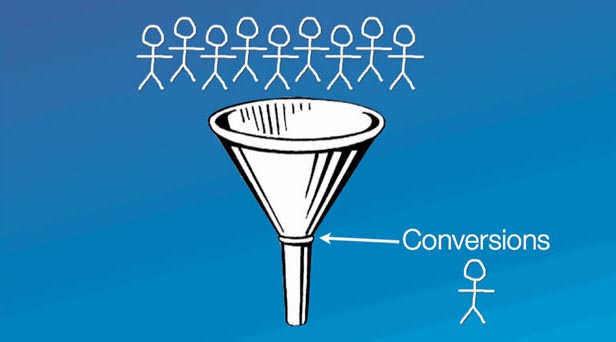
Chances are that your marketing department spends endless hours devising new strategies and optimizing campaigns to send more traffic to your website and push your prospects to the right page to process an order. From strong social campaigns to top of the funnel content, to personalized landing pages and buying traffic, marketing’s job is to bring leads to sales. But sometimes it’s more about the people that arrive to your website, view your products and still don’t make an order. These top of the funnel prospects need you to dig deeper into your website conversion process and find out why they may not buy from you.
A beautiful website with amazing graphics and inspired content may seem like just what it takes to drive conversions, make people buy and increase order volume. Although you may delight and capture the senses of your website visitors, it’s possible that you are missing the mark and need to improve the order of your offerings and site navigation to create a clear plan of action for visitors. Don’t worry, many companies struggle with this exact issue.
The new generation of “webizens” are convenience customers, meaning that they want to be able to glean the most important information easily and navigate exactly to the right places on your site. Their time is valuable and your customer experience game needs to be tip top. There is an ultimate action that you want your users to take, and the clearer that journey, the higher your conversion rate will be. Here are a few key features that you should not neglect when optimizing your website for conversion and driving purposeful action on your site.

Nail Down the A/B/Cs of Testing
Optimization is an ongoing process. As your customers’ needs change and your product evolves, so should your site. The testing process is ongoing and you must constantly seek the most optimized website to give the information necessary for that valuable conversion.
Your intuition in messaging and design may be spot on, but nothing replaces the importance of testing your website. An element of your conversion funnel that you believe is strong, can always be improved by tweaking colors, placement and text. There are a few prime areas for optimization that you should always be testing to improve your conversion rate:
Page Layout and Navigation -Testing out CTAs in different places, with varied layouts to find optimal navigation are all great practices for increasing conversion rates online. Test different landing page layouts and discover which most successfully drive the action you want.
Messaging and Headlines – Online “reading’ oftentimes becomes more likes scanning. Are your headlines and messaging clearly presenting who you are and your offering? Most of the traffic to your site is short on time and depends on you to clearly present relevant marketing information to help them take the right action.
Calls-to-Action- Playing around with the wording and testing the placement and volume of calls to action on your site are good ways to begin. Don’t miss the moments when your customers are looking to self-serve themselves, this is a perfect time to drive conversion. Add calls to action in your support section and FAQs as well.
New Media – Video and other engaging graphics can have a large impact on website conversions, people want to quickly learn about you with as little effort as possible. Entertain them, it will drive conversions. Video on landing pages can directly impact your profits by providing your site traffic with truly engaging marketing material in lieu of run of the mill content with expected calls to action.
It’s all about action. What will drive the desired action you want from your website traffic? Increased profits and conversion rates are inevitable with proper testing of your marketing messages.


